
In this option, we will show you how to modify the H1-H6 size for mobile devices for this follows the below steps:
You will find this option in the WordPress Dashboard -> Navigate to AMP option panel -> Design -> Signal -> Enable H1 – H6 Font Sizes option as shown below the screenshot.
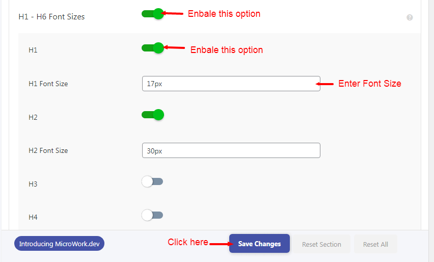
It will change the font size to 17px in AMP for both the desktop users and also for the mobile users BUT if you want to make the font size different for desktop and mobile users then you can add this CSS and add it like –
You will find this option in the WordPress Dashboard -> Navigate to AMP Option Panel -> Design -> Global -> In Custom CSS add this code like below the screenshot.
For example:
@media (max-width: 768px){
.amp-post-title {
font-size: 15px;
}
}
So now the desktop users will have a font size of 17px and the mobile users will have a font size of 15px.
That’s it for this tutorial!
We hope it helped you. If you have any feedback or questions, then please share them in the comments section below.